")
Be bright, be bold, and contrast, contrast, contrast! Steve Davey sums up the key rules of capturing colour with your camera
We all see in colour, yet we all take it for granted. We are bombarded by colours everyday, and they have a profound effect on us. They influence where we look, how we look, even how we think.
The primary way to exploit colour in your pictures is through composition. Assuming that you are not going to carry around a bright red apple to place artfully in your every frame, you have to observe and notice the colours that are there, and then compose your picture in such a way that they are presented effectively.
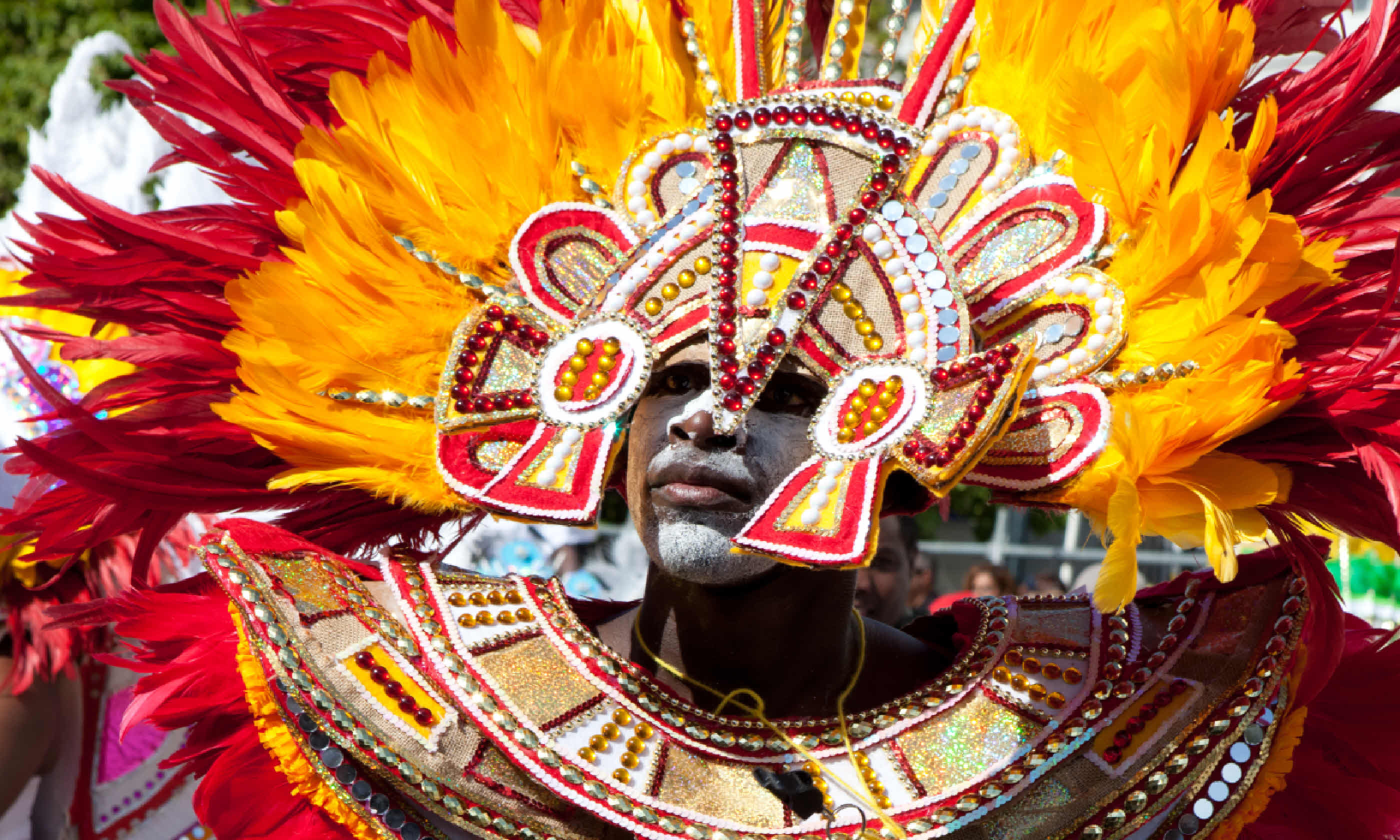
One of the most powerful ways to use colour is to compose your picture with a dominant tone to draw the eye to the subject. The most effective dominant colour is red, especially on a green or blue background. For instance, a single red apple in a pile of green apples will immediately stand out and draw the eye.
Your camera gives you a high degree of control over how colours are rendered in your picture – especially if you are shooting in the more versatile, higher quality RAW format. RAW files require postprocessing on a computer; here you can adjust the white balance of the image to warm-up or cool down the overall colours.
This will go some way to affecting the mood of the picture: warming the white balance will emulate the light at sunset, giving your pictures a happier, more pleasing feel; moving the white balance towards the blue scale will make the picture feel more moody and cold.
You can also control the saturation of the image. Increasing the saturation will make the colours punchier and brighter; reducing the saturation will give a more muted effect.
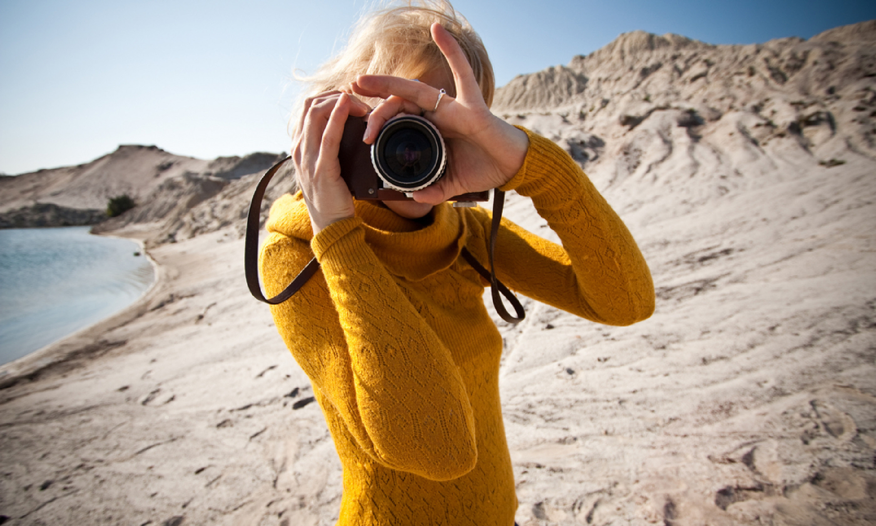
Include an element of colour that contrasts with the rest of the picture: it will draw the eye and help viewers decipher the image. The most dramatic hue to use is red; also, yellows/blues and oranges/greens contrast nicely.
The effect works best if the area of contrasting colour is relatively small and not centred.
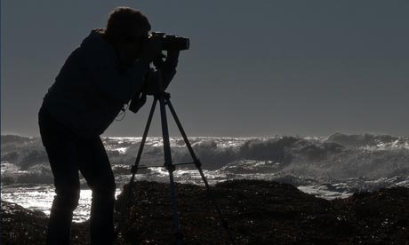
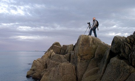
Some subjects can look almost black and white, even though they’re colour; shooting such a subject is especially effective if there is an element of colour in the image. The muted palette doesn’t have to be monochrome; it could be browns or greens, depending
on the subject.
You can create bold images by capturing a series of repeating colours. A classic example would be a picture of a pile of bright-red chillies under a tropical sun. Combining this with the inclusion of a sole contrasting object (one green chilli, perhaps) can make your images rather striking.
The white balance can affect the whole mood of the picture. Warmer tints look happier; bluer casts look colder and more bleak. You won’t be able to completely change the mood of the picture in this way – it will look contrived and unnatural – but you can use the
white balance to subtly enhance the mood already present.
All the colour combos are out there – you just have to spot and then compose with them. Think about your angle, viewpoint and lens choice; crop to show the colours you want, exclude those you don’t.
You can influence the intensity of your pictures’ colours in post-processing by subtly tweaking the white balance and saturation. Some software has a vibrance option, which avoids oversaturation on skin tones.
A polarising filter can give more saturation to colours, especially skies, water and foliage,
where reflections of light on the surface make colours appear washed out.
Careful composition using colours can help to lead the eye around an image, so the person looking at the picture knows where you want them to look. With this image of the Golden Temple (above), most of the picture is in shades of blue and white, so the eye is instantly drawn to the pilgrim’s orange turban and then to the Golden Temple, establishing the link between them.
Read more of Steve’s tips in our sister publication, Take Better Travel Photos